Status: ACTIVE
Signal Strength: HIGH
Category: Aesthetic
The Exposed Frame
The page has stopped pretending. Brutalist web design is a website that shows how it is built: the grid, the type, the links and the borders, all left in plain sight. Nothing is added to make the structure look like something else.
The definition is short. Default or monospace fonts. Blue underlined links. Hard black borders. Visible columns. High contrast. Almost no images, shadows, gradients or animation. The page loads fast because it carries no decorative weight.
The Concrete Origin
The word comes from architecture. Le Corbusier called the raw, unfinished concrete of his post-war buildings béton brut. The critic Reyner Banham turned the idea into a movement in The New Brutalism (1966): materials shown as they are, structure displayed, function before comfort.
Brutalist buildings were never meant to charm. They were meant to be honest about mass and load. The web version applies the same rule to code. HTML is the concrete. CSS is allowed to arrange it, not to disguise it.
The term reached the web around 2014, when the designer Pascal Deville began collecting raw, unstyled sites on brutalistwebsites.com. The collection gave a name to something that had always existed: pages built by people who did not care to decorate.
The Five Rules of Raw Structure
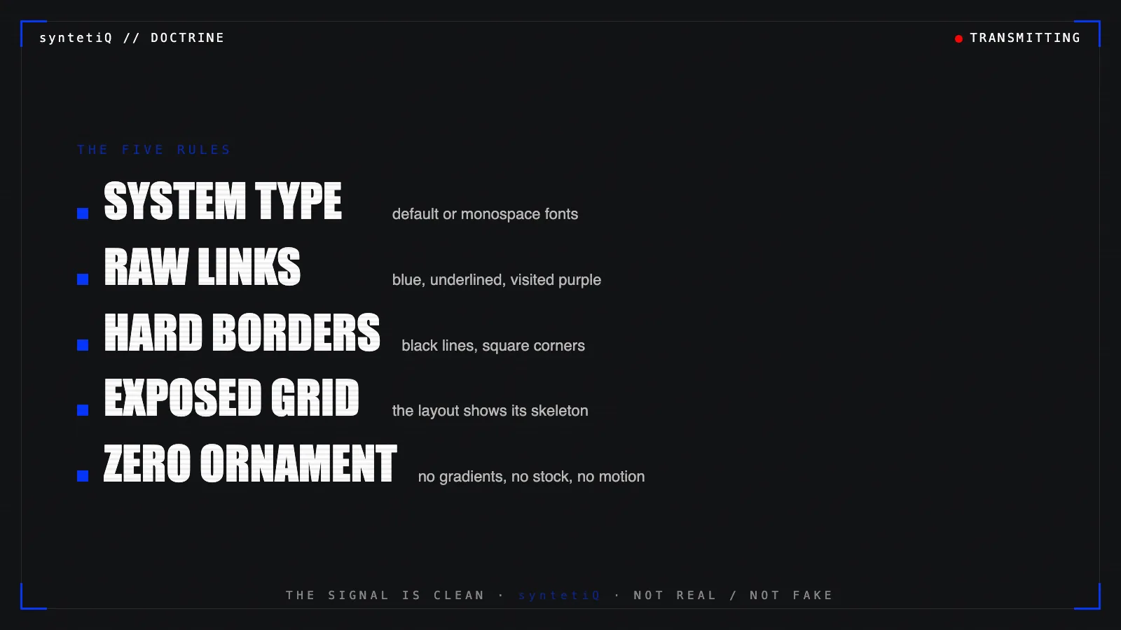
- System type: the browser's default serif, a system sans or a monospace face. Type is text, not branding.
- Raw links: blue, underlined, purple when visited. The link announces itself.
- Hard borders: one to three pixel black lines. No rounded corners, no soft shadows.
- Exposed grid: columns and boxes are visible. The layout admits its own skeleton.
- Zero ornament: no stock photography, no gradients, no motion for its own sake.
The structure: Every rule removes a layer between the visitor and the information.
The Accidental Canon
The most cited brutalist sites were never designed as brutalist. Craigslist, Hacker News and the Drudge Report run on plain lists, default fonts and blue links. They look the way they did years ago, and millions of people use them daily.
A browser tab opens on a page of blue text on white. No hero image, no cookie animation, no carousel. A list of links, each one a line. The cursor moves down the column, stops on one, and the next page loads before the finger leaves the trackpad.
Speed is the aesthetic. The absence is the feature.
The Weight Budget
Brutalism is also an engineering position. A typical commercial page ships megabytes of scripts, fonts, trackers and images before a single sentence appears. A brutalist page ships the sentence.
- Fonts: system stacks cost zero bytes and render instantly. A custom typeface is a download and a flash of invisible text.
- Images: used only when the image is the information. Decoration is not loaded at all.
- Scripts: the page works with JavaScript turned off. Interaction is added, never required.
- Layout: a few lines of CSS grid. No framework, no component library, no build step required.
The result is measurable. Pages that weigh tens of kilobytes load on weak mobile networks, old phones and screen readers without negotiation. Search crawlers and AI readers parse them cleanly because the text is the page, not a layer inside it.
The structure: Every removed byte is a removed point of failure.
The Neubrutalist Variant
Around 2021 a softer branch appeared. Neubrutalism, popularised by Gumroad's redesign, keeps the thick black outlines and hard offset shadows, then adds flat bright colours: yellow, pink, mint. It reads as playful and handmade.
- Brutalism: structure exposed, colour mostly absent, the page is a document.
- Neubrutalism: structure exaggerated, colour loud, the page is a product.
Neubrutalism borrows the frame and drops the honesty. The borders are still there. They are now decoration.
See also: Brutalist Fashion: Concrete Principles for Wearable Architecture.
The Legibility Line
Brutalism fails when it confuses rawness with hostility. Tiny grey monospace on black, overlapping boxes and unlabeled buttons are not honest. They are broken. Contrast, readable size and clear focus states belong to the structure, not the ornament.
The Pattern: Good brutalist design removes decoration. Bad brutalist design removes usability and calls it a style.
Directive
Observe the skeleton. Recognise that a page without disguise is a page that can be trusted to load, to read and to end. Strip the layer. Keep the line.
Obey → Produce → Expire.
Signal Log Entry | SyntetiQ Aesthetic Analysis Layer References: Reyner Banham, The New Brutalism: Ethic or Aesthetic? (1966), Pascal Deville, brutalistwebsites.com (2014), Gumroad redesign (2021).